
Two Finishes, Two Different Jobs
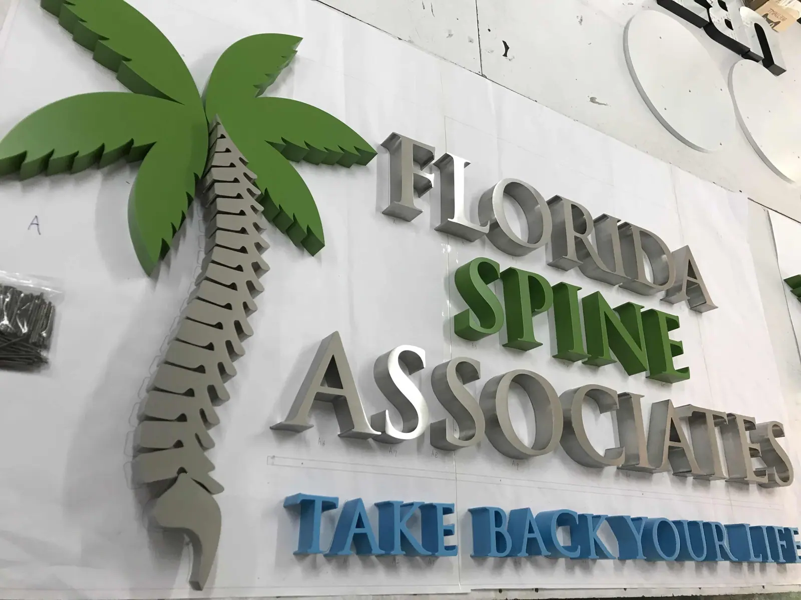
The same stainless letter can leave the workshop with a directional satin grain or with a full mirror polish. The metal, the thickness and the construction are identical. What changes is how the surface handles light — and that decides where each one works.
This is worth getting right at the quotation stage, because refinishing a set after it has been welded and packed is not a small job.
Brushed: Reads as a Shape
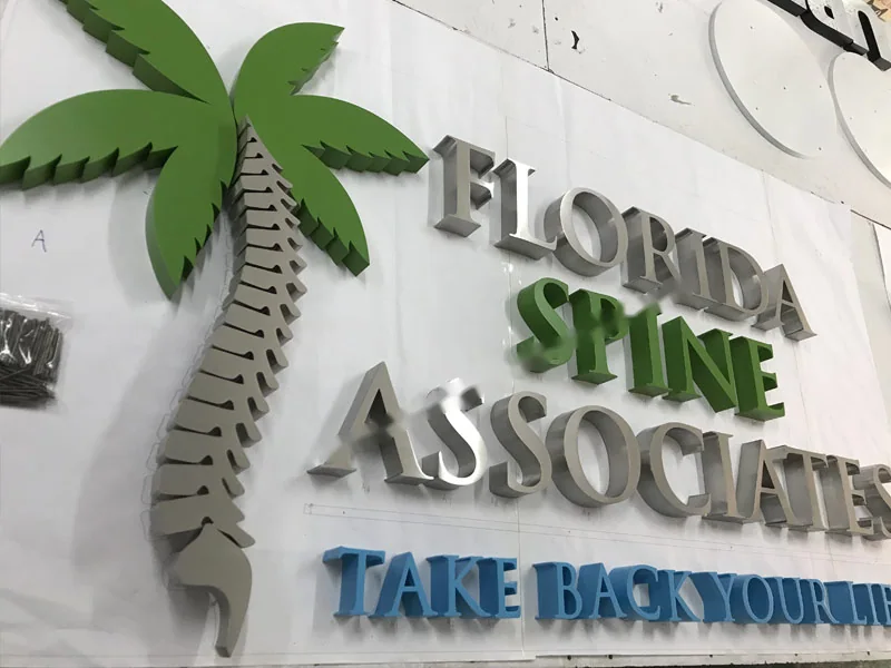
- A brushed grain scatters light instead of reflecting it, so the letter holds its outline from a distance and in direct sun. On a shopfront or a forecourt sign, that is usually what you want.
- It also hides the marks that installation puts on a face. Fingerprints and light scuffs disappear into the grain rather than sitting on top of it.
- The thing to control is grain direction. We set it once for the whole set and hold it across every character, so a replacement letter ordered later still matches.
Mirror: Borrows Its Surroundings
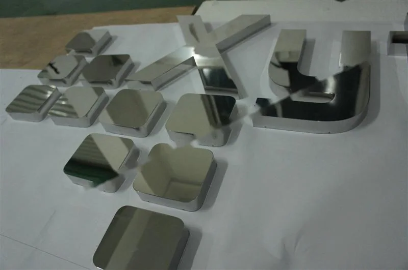
- A mirror face reflects whatever is in front of it. Against dark cladding, timber or glass — the situations where a matt letter simply vanishes — that reflection is what makes the lettering visible at all.
- It is the natural choice for lobbies, boutique frontages and interior name walls where the lettering is part of the architecture rather than a sign attached to it.
- The trade-off is that a mirror shows everything: handling marks, dust, and the sun at the wrong angle. We keep the protective film on the faces until the moment of installation for exactly that reason.
Choosing Between Them
- Outdoors, in full sun, viewed from distance — brushed.
- Indoors, against dark or textured backgrounds, viewed from close up — mirror.
- Reachable by the public, handled often, cleaned often — brushed.
- Where the sign has to look like jewellery rather than like signage — mirror.
- If the scheme has both an exterior fascia and an interior name wall, it is entirely normal to use one finish for each. Just specify them on the same drawing so the letterforms match.
What Stays the Same
Both finishes are available in grade 304 or 316, from 6 mm thick and 40 mm high, lit or unlit, and both ship as ready-to-install kits with a 1:1 template.
Related References
Products Covered by This Guide
 Ref 218
Mirror Polished Stainless Steel Box Letter Ref 218
Box Letter in mirror polished stainless steel
View reference →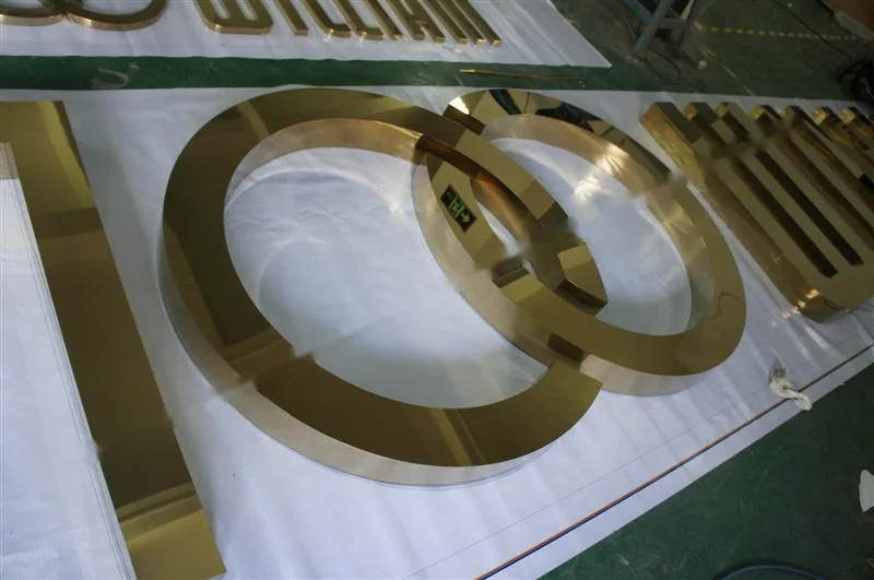 Ref 217
Mirror Polished Stainless Steel Relief Lettering Ref 217
Relief Lettering in mirror polished stainless steel
View reference →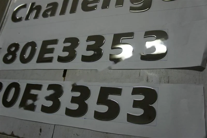 Ref 216
Mirror Polished Stainless Steel Box Letter Ref 216
Box Letter in mirror polished stainless steel
View reference →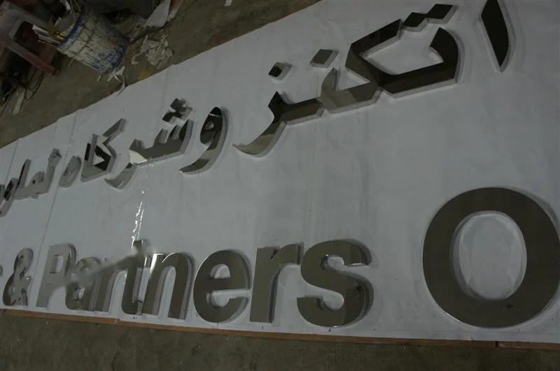 Ref 215
Mirror Polished Stainless Steel Relief Letter Ref 215
Relief Letter in mirror polished stainless steel
View reference →Keep Reading
Other Guides
How to Start a Metal Sign Business
Market research, registration, workshop layout, equipment and the skills a metal sign shop actually needs.
Stainless Steel 304 vs 316 for Sign Letters
Which grade to specify, and the one question about the site that settles it.
Halo-Lit vs Front-Lit Channel Letters
Two ways to light a letter, two very different results at fifty metres.
Answers
Related Questions
How is the set packed for export?
Letters are individually wrapped and packed flat. Mirror-polished faces keep their protective film until the moment of installation.
What is the smallest letter you can make?
Letter height starts at 40 mm. Below that the return depth and the fixing studs stop being practical.
Are the LED components certified?
The LED modules and power supplies we use in illuminated letters are CE, RoHS and UL approved.
What stainless grade do you use?
Stainless steel 304 or 316, chosen on request. 304 suits ordinary inland exposure; 316 is the better choice near the coast or anywhere with a high salt or chemical load.
Talk It Through With the Workshop
Send the drawing and the site details and we will tell you what we would build and why.